As we have just updated our database with the newest dataset on Deaths in England & Wales, I thought it would be useful to produce some graphs to illustrate the death data.
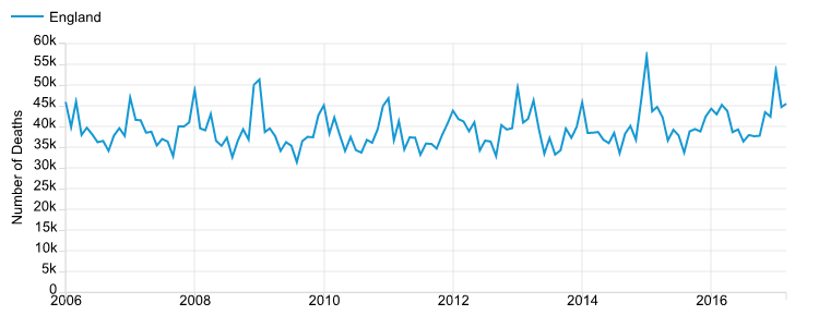
The monthly number of deaths occurring in England. Data source: ONS
The above plot shows the number of deaths occurring every month in England. It can be seen there are lots fluctuations in the data. However, it doesn’t look like the overall trend has been increasing or decreasing in the past 10 years. Nevertheless, there seems to be a very strong seasonal pattern. On the face of it, it looks like deaths increase in the Winter and decrease in the Summer.
A CLOSER LOOK AT DEATH DATA
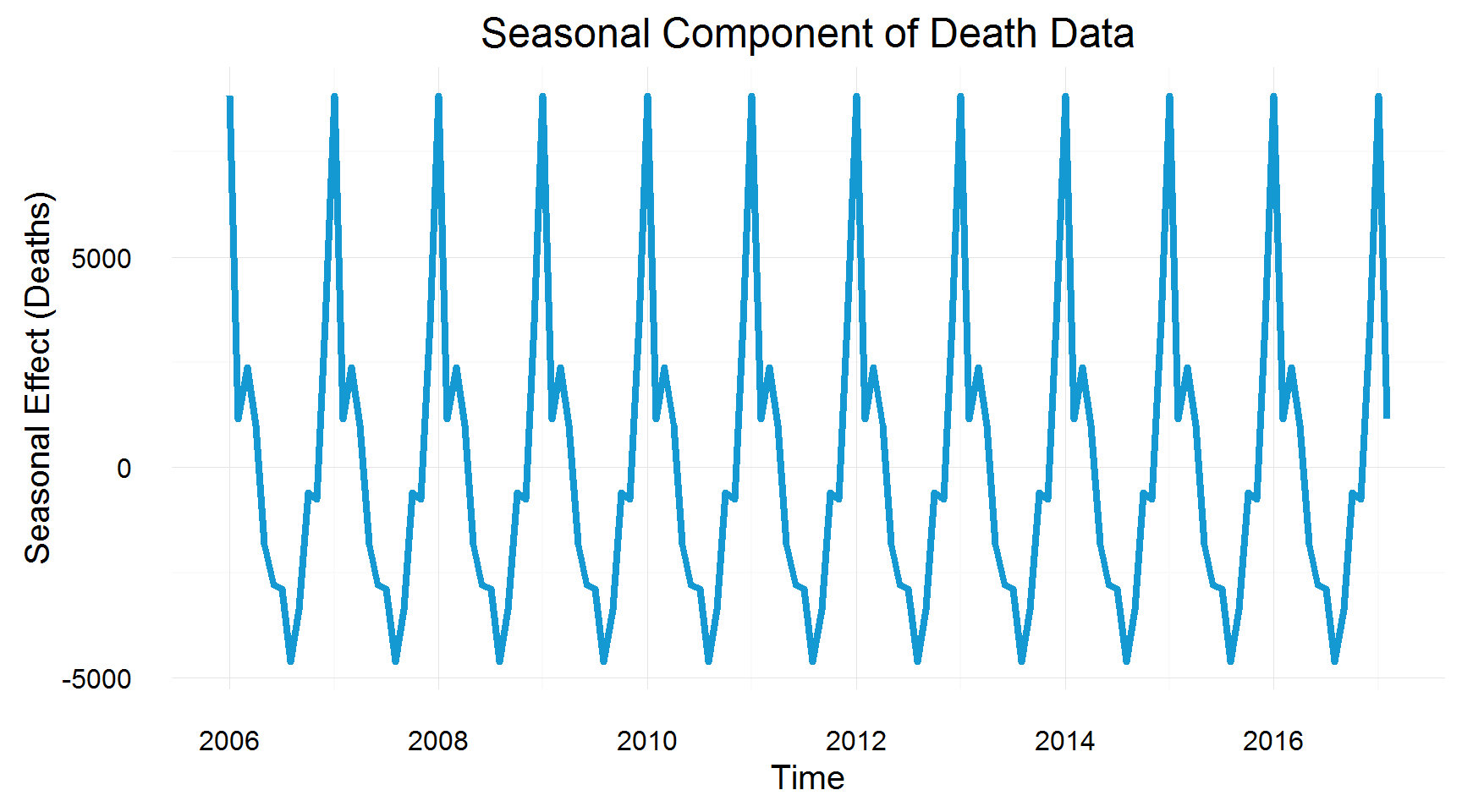
Seasonal Component of Death Data. Data source: ONS
From the graph above, it can be seen there is a very clear seasonal pattern in the number of deaths. The winter months have much more deaths than the Summer months. Let’s take a closer look at one of these spikes.
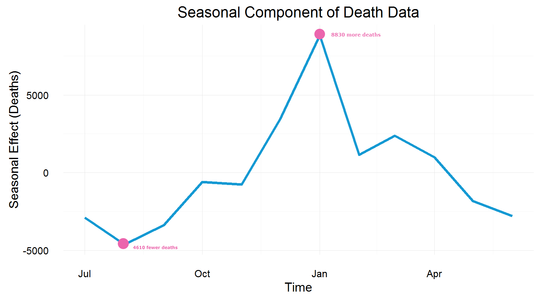
Decomposition of Death Data. Data source: ONS
Now, we can really see what is going on with the death data. It can be seen from the graph above that the seasonal effect of deaths is the strongest in January and the weakest in August. Simply put, you would expect 8830 more people to die in January (compared to the monthly average) and 4610 fewer to die in August (compared to the monthly average).
THE SEASONAL COMPONENT OF DEATH DATA
The previous chart certainly makes it look like deaths depend on the temperature. More deaths occur in the colder months compared to fewer deaths in warmer months. To test this, let’s look at the maximum monthly temperatures in England over the same time period. To illustrate this, the same seasonal decomposition can be performed to have two comparable charts.
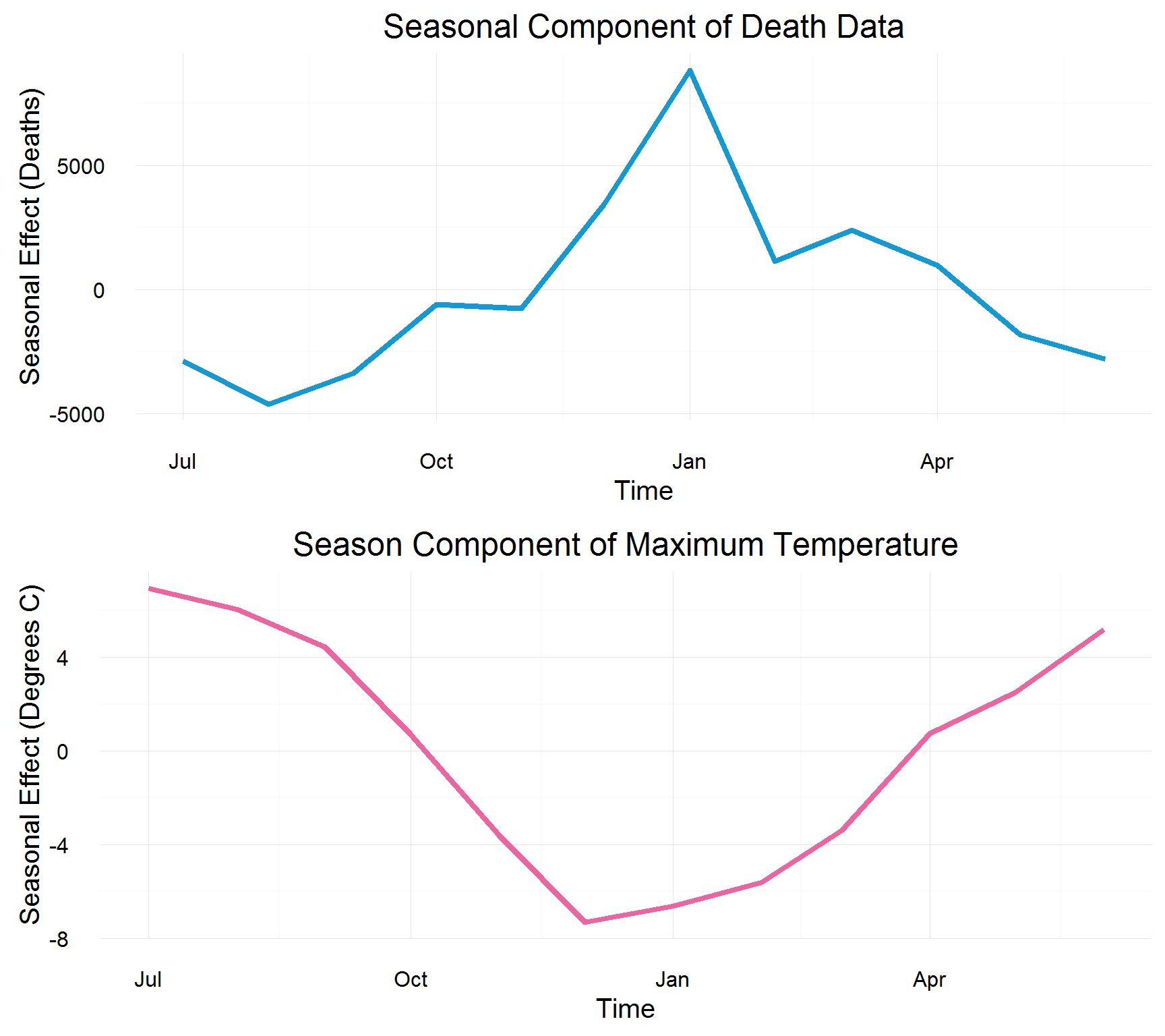
Seasonal component of death data and maximum temperature. Data source: ONS
From this, it’s quite clear that the seasonal effect of deaths is very highly correlated with the temperature. In fact, the correlation is 84%. Now that we understand the seasonal effect of death is due to it getting cold in winter, we can look for patterns by examining the underlying trend. To do this, we will subtract the seasonal effects from the data.
ARE THERE PATTERNS IN DEATH NUMBERS?
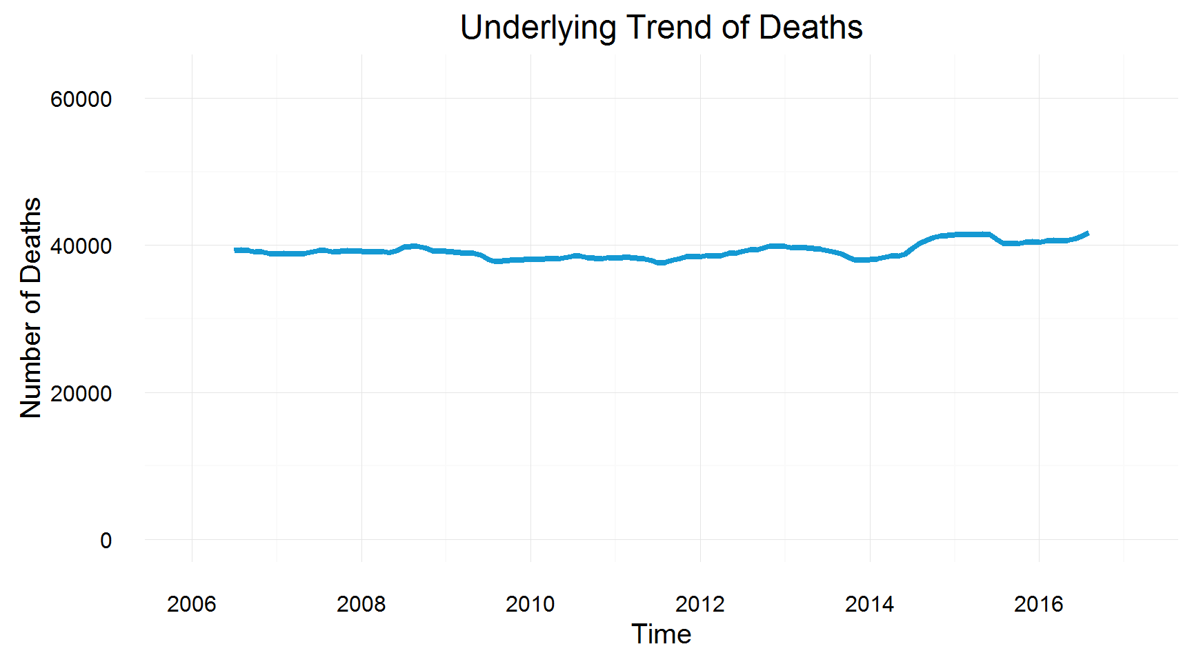
Underlying Trend of Deaths. Data source: ONS
This underlying trend is a lot more stable – it barely increases or decreases over the past decade. The linear model is suggesting deaths are increasing at a rate of 0.1%.
Moreover, we can visualise this slight increase using a linear trend line.

Underlying trend of deaths compared with a linear trend line. Data source: ONS
Although the trend is fairly non-volatile, there are still bad years as well as good years in terms of death numbers, which cannot be explained by the seasonal temperature. Also, it can be seen from the graph that the linear trend for deaths is increasing. Nevertheless, it’s nothing unusual as England’s population is also increasing (see the graph below). However, it does look as though the population of England is increasing slightly faster than the number of deaths. This can be partly explained by the ageing England’s population.
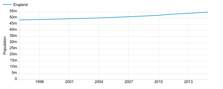
The increasing English population. Data source: ONS
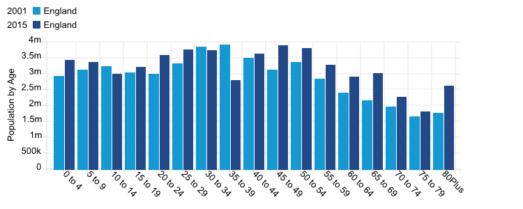
This bar chart shows how the population of England is ageing. It compares the age breakdown of England’s population between 2002 and 2015. There is not much difference between the bars for the earlier age bands, however, the later age bands show a disparity. Interestingly enough, there are nearly one million more people aged 80+ plus in 2015 compared to the same age band in 2002. It explains why deaths are not increasing as fast as the population.
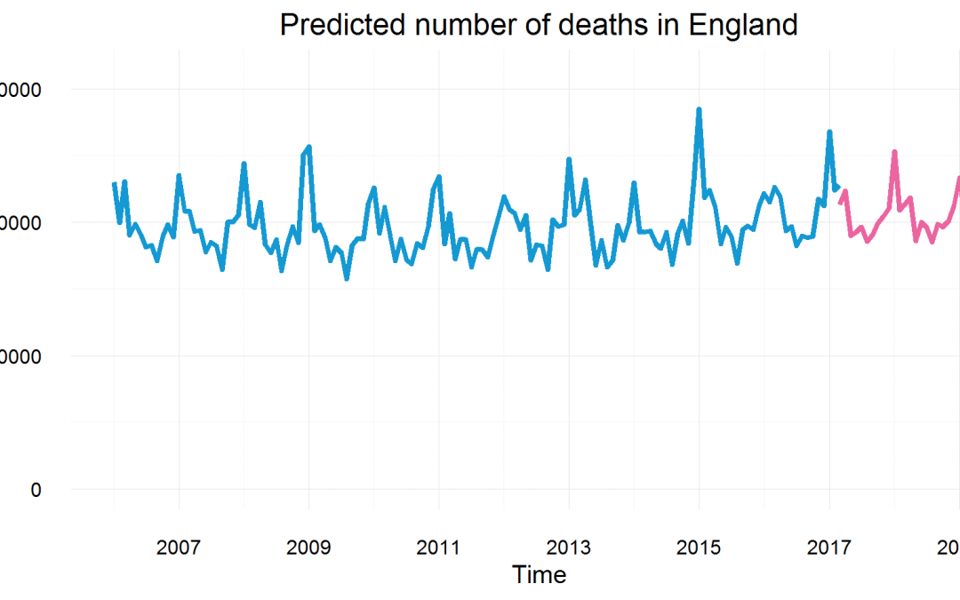
THE PREDICTION OF DEATH DATA
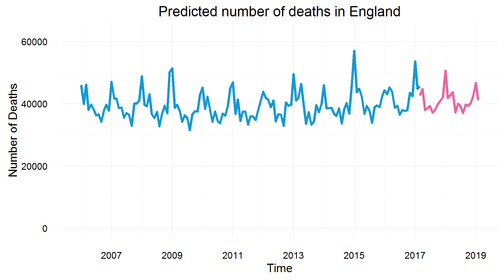
Predicted numbers of deaths in England. Data source: ONS
All in all, we can use the knowledge of death data seasonality and its trends to predict the number of deaths occurring in the next two years. It can be seen that the predicted model has maintained the shape of the seasonal effects. Also, the prediction shows the increasing number of deaths, which we expect from our analysis of the underlying trend.
Get notified when new content is added
Join our mailing list to receive notifications when new content is published
You have Successfully Subscribed!