Google Maps has had a revamp
Google Maps got a major new update in August 2020. With this update, users received several enhancements to map visual quality. These changes have helped to transform the look of our world’s landscape. The scale of this update is huge, which got me thinking, just how integral are maps to our lives and how we do map data visualisation?
Whether you’re planning your next trip, looking for a new place to eat, or need to know what the traffic is going to be like later, Google Maps plays a key role in many of our everyday routines. Because of this, the update greatly improves the average Google Maps user experience. However, for those of us that work with Google Maps for geospatial data analysis as part of our business, this update has a deeper impact on presenting data that I feel is important to explore.
Maps are a deeply rooted form of Data Visualisation
At Gavurin, we realise that this Google Maps update has the potential to substantially enhance data analysis and graphical presentation capabilities for many organisations. To understand its advantages, it’s important to establish some background on the importance and implications of using map data visualisation.
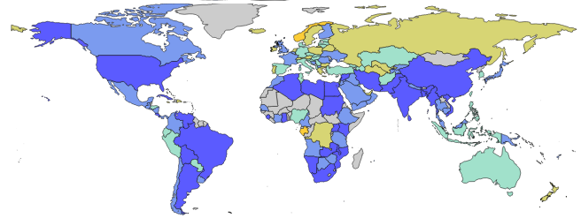
Maps are a popular tool used for the presentation of data and information across many sectors. While the origin of maps is primarily as a navigational tool, they have grown as a data technology over the last few decades to meet the world’s need for interconnectivity and expansion of business globally.
Powerful tools with powerful results
Maps have enabled people to more easily display data and insights on a large scale, as well as on a granular level for precise analysis, something that is not so easily accomplished without the map visualisation format to support it. Presenting data on a map, as opposed to textually or with another form of chart visualisation, enables businesses to discover patterns, anomalies and present findings with ease. The possibilities are endless. Maps can be presented in an exciting, colourful, and sometimes even interactive way. They are amazing tools. People at all levels of data understanding can gain valuable information with this ever growing and accessible format.
Google Maps is often thought of as one of the go-to platforms for map data visualisation in businesses. This should come as no surprise considering their extensive feature library and extensibility with other visual libraries. This makes it an undeniably excellent choice for presenting geospatial data effectively. Google Maps holds a high reputation, evidenced by the fact that over 3.6 million websites have Google Maps embedded in them, according to SimilarTech.
Change is here, and it’s very promising
Having established the immense potential of maps, you should now be able to see why we were excited when the Google Maps team announced they were adding a wide array of improvements to their platform. While they regularly add new functionality every few weeks or so, this change is significant as it drastically affected many of the existing graphical features Google Maps boasts.
Colours, Terrains and Textures, oh my!
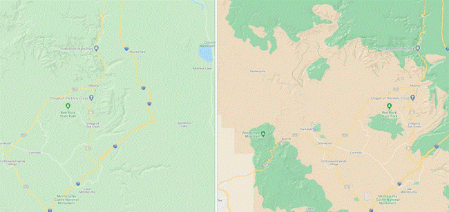
Most notably, Google have added a more vivid colour palette to Maps to display terrain like beaches, water, snow, mountains, forests and density more comprehensively. The fine details of what an area actually looks like are more accurately depicted with the help of Google’s computer vision technology and extensive satellite imagery capabilities (covering 98% of the world’s population!).
This change has the potential to help analysts flag any geographical implications for data analysis more easily for certain domains, so more informed decisions and business-specific adaptation can be made where appropriate.
If organisations can better understand their geographical markets with enhanced map data visualisation, they can deliver higher quality services to meet new and existing demands based on the data. Data can raise as many questions as it answers, so this added context can help us to further understand why a pattern or trend is forming.
An example of what the colour palette used to look like in Google Maps compared to what it looks like after the update can be seen in the following image.
Urban landscapes transformed
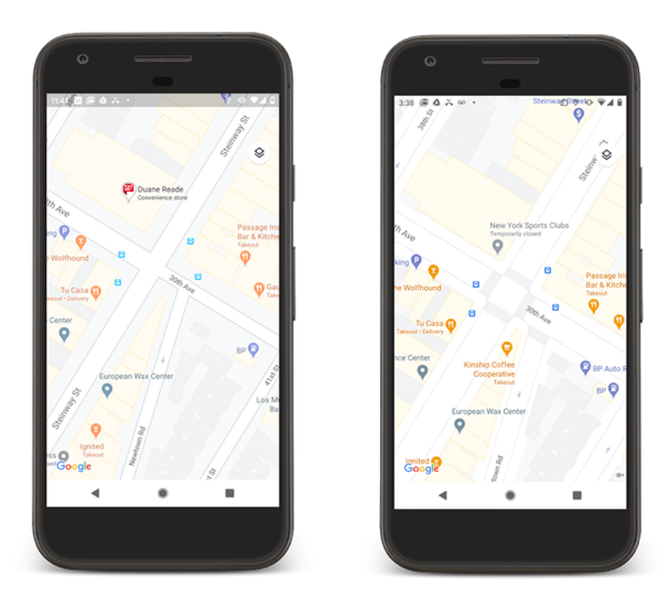
Along with the colour palette upgrades, Google added more detailed visuals and information to many of their map features. These include:
- Improved cycle lane route mapping
- Locations for pedestrian paths
- More markers for facility accessibility considerations
- Road shapes and widths more accurately calculated
This part of the update focuses on major cities like London, New York and San Francisco for the initial rollout. This change really helps to reflect the reality of what our cities look like, which has huge implications for companies dealing with urban geospatial data, transport, retailers based in those areas, development projects, as well as better human behaviour monitoring for the benefit of city infrastructure.
Data Analysis practices can be optimised relevant to both the environment that people and companies are based in, and the locations they pursue commerce within. This update provides so much exciting opportunity for businesses when analysing and presenting data.
Here’s how the update could be used
This update is going to be a great addition to many people’s toolkits in the data visualisation community. Especially considering over 7600 companies use Google Maps in their tech stack specifically for data visualisation, according to StackShare. Here’s how I envision the update could be utilised by organisations to transform how they do graphical presentation for geospatial data in real world scenarios.
Some of the main sectors that come to mind when thinking of this update are the services and delivery industries. From parcel deliveries to takeaway food orders, companies like Sainsbury’s, Nando’s, Argos, and many more household names that already use Google Maps for map data visualisation in their daily operations would benefit from having enhanced map visuals.
In the case of Argos, they use Google Maps location data on their website to help customers locate the nearest store to collect their orders at. Adding this functionality helped Argos to analyse customer journeys and behaviours over time, increase in-store traffic, reduce resource costs due to less home deliveries, and improve the customer purchasing experience overall. Incorporating the new Google Maps update into their existing visualisation practices could help them expand this progress further to potential new markets based on geographical location and the typical journeys of their existing users.
Whether it’s planning driving routes to best optimise time and labour requirements or identifying trends in sales and tapping into new geographical markets, there is a wealth of opportunity for these industries to expand and adapt to meet their audiences needs across the globe.
Placing importance on essential industries
The Google Maps update also has so much potential for the presentation of data and information for essential industries like infrastructure, housing, banking, insurance, utilities and more. WebGeoServices touches on the details of how organisations within these industries utilise Google Maps. According to them:
- Allianz Insurance uses Google Maps data visualisation to warn clients of potential natural disasters, as well as planning their breakdown assistance recovery times. Having access to detailed maps would improve how they track this data and optimise their performance for customer satisfaction.
- Lloyds Bank uses Google Maps to visualise their user’s locations so they can target personalised marketing campaigns to the right audiences, monitor traffic to their branches and even prevent fraud by proving a person’s location using geospatial data. The update would certainly enhance the possibilities in these areas for them.
- EDF uses Google Maps to analyse patterns in energy usage across the UK. Improved maps with accurate landscapes for presenting data would help them to better understand these patterns in context with their geographical considerations.
Considering these use cases, I think it’s amazing to imagine how the Google Maps update would help to develop and improve these organisations’ graphical presentation practices for the future.
How Gavurin is using the update
At Gavurin, we work with map data visualisation every day and we supply this functionality to several of our clients for the presentation of data and information. In June 2020, we began work to present the cases and deaths data for the COVID-19 pandemic in both the UK and USA, one of the biggest topics for geospatial data analysis in 2020. See here.
This update to Google Maps gave us the potential to alter how we represent the COVID-19 data on our Gavurin Analytics platform. Combining the updated Google Maps visuals with our coloured overlays to represent case and death distribution across different geographies, we are now able to understand the density and real geographical outlook of the areas most affected by COVID-19 in more detail.
Ultimately, this helps us and others to better establish potential geographical reasons behind the virus spread.

A world of opportunity opened
I hope you now have a better understanding of the importance of Google Maps in the world of data visualisation. This Google Maps update unlocked the potential to positively affect businesses and individuals alike if we learn how to properly utilise these new mapping capabilities within our specific contexts. Whether it’s for essential industries or topical situations, the potential to improve how we discover data insights through geospatial data analysis is great. This raises a few interesting questions:
Have you ever considered how maps and data affect your own life or your company operations?
What would you like to see be done with map data visualisation to make improvements in the world?
To discover…
how Gavurin can support and help you take advantage of map data visualisation, Contact Us.
Get notified when new content is added
Join our mailing list to receive notifications when new content is published
You have Successfully Subscribed!