What makes us different? We’re different because we’ve worked innovatively to address key challenges for users of data.
I’ll come to Gavurin’s USPs – but first, some context.
The Cambridge Analytica / Facebook scandal
For most of us, the Cambridge Analytica Facebook scandal is ephemeral. It’s ephemeral because the numbers are too big and there is no reference point. 275,000 users, 50,000,000 links from them. What do these numbers mean? They have scale – they are big, but they have no significance. To have significance, numbers need context and communicability.
What good Analytics must do is create context so that a user can determine significance and it must make it possible to tell others. But above all, it must make it EASY to do these things. I am going to show how we try and make things easy and why, by identifying our 4 Gavurin USPs
Context delivers significance
There is really only one way to create context from numbers and that’s by comparing them. 50,000,000 seems a big number of people, but it’s less than 1% of the world’s population. However, it’s 3% of Facebook users and it’s 15% of the American population. Is the last number significant? We could perhaps refine it by voting age population. Would that enhance its significance? We could refine it further by State. And so on.
Identifying what makes a number significant is not the job of Analytics. Software cannot substitute for the judgement necessary. However, making it easy to do the comparison is indeed the job of Analytics. Comparison numbers appear in one of three formats – in tables, on charts and on maps. We’ll concentrate on charts and maps here.
Easily comparing numbers on a chart
This sounds SO trivial – but it really isn’t. This is surprising because the permutations of sensible comparison are limited. They are:
- Comparing other data: you might want to compare one set of data with another. You shouldn’t perhaps compare the number of overflying storks with fertility, but if you want to, then it should be possible to do so with 2 clicks – one to open a data explorer and a second to add the data.
- Comparing other times: time line charts are common but the longer the timeline the more difficult it is to ‘see’ a pattern. So, easily filitering time is important.
- Comparing other places: this is the much more challenging exercise because data and places are uncomfortable companions. For example, a user might know their own postcode but the likelihood of data being available for it is remote. So the user must be able to search the postcode and get data for as close a geography to it as possible. But even that is rarely simple. Searching the postcode is likely to deliver data at multiple geographies that contain the postcode (the district, the town, the country, the continent and so on) and the user must be able easily to select one, or more, of them.
- Comparing places on a map: a map is a ‘chart’ because it can capture shaded areas (known as polygons). Adding and subtracting polygons is therefore the map equivalent of doing the same on a conventional chart.
So, if that’s the context, here are the Gavurin USPs which go to it.
Gavurin USPs: ONE: handling geography
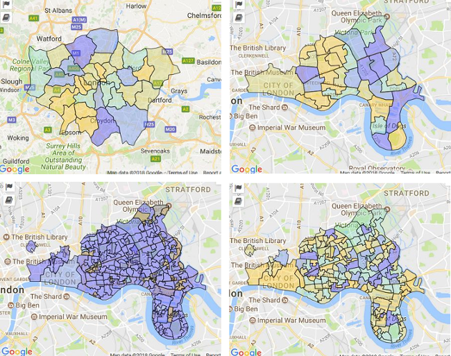
Drilling into geography – easily (click to enlarge)
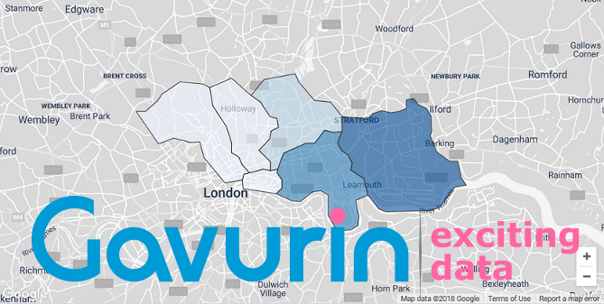
If your data relates to a place, the best way to find that data is to search for the place using the familiar Google Maps interface. Gavurin Analytics exploits the power of the Google Maps interface – and enhances it.
For example: you want to know something about the population around your local supermarket. You don’t want to scrabble around looking for its postcode / zipcode or the precise number of the long road it’s on – use Google Maps to search for the store by name and Gavurin Analytics does the rest.
Gavurin Analytics will deliver your data for the store area with as much precision as the data permits.
We expect also that you will want to move up the geography hierarchy, or alongside it. And with one click you can do both of these things. The image here shows increasing levels of geographic detail in an area of London – each delivered from the other with a single click. Of course, each time you change the map – you can expect to see your chart data change to match it.
Gavurin USPs: TWO: Creating context by comparison
As we note at the beginning, comparison is crucial. Without it, numbers have little significance. So creating comparison fast is crucial.
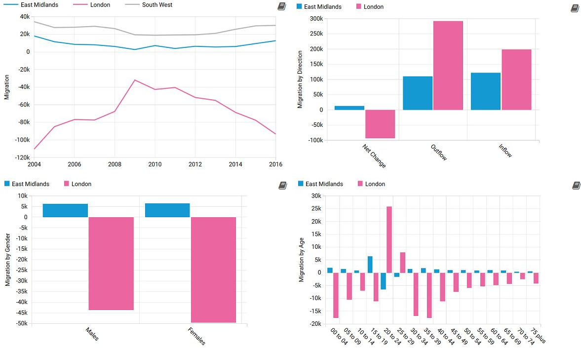
UK migration story: 4 charts / 4 comparisons (click to enlarge)
The charts here tell the story of migration in the UK – the movement of people from one Region to another. Each chart tells a different feature of the same story (changing the feature – 2 clicks) and each feature shows the comparison between one region of the UK and London – which is losing population dramatically (adding a place comparison – 1 click).
Moving clockwise: chart 1 shows the steady NET loss of people from London to other regions of England (this data does not show immigration from outside the UK). In 2016 – more than 90,000 people left London. Two of the largest beneficiaries of that migration were the East Midlands and the South West. Chart 2 shows the flows to/from London and the East Midlands. This chart shows an inflow to London of around 200,000.
It follows that we need yet more ‘context’ to identify the true significance of this: charts 3 and 4 deliver that.
Chart 3 shows us that around 7,000 more women than men left London. And Chart 4 tells us that between the ages of 20 and 29, London attracts people and the East Midlands loses them.
There are of course major considerations that flow from this to do with housing, health, recruitment and attraction of employees, and so on.
The point is that Gavurin Analytics enables this story to emerge with speed and ease.
Gavurin USPs : THREE: telling a Data Story
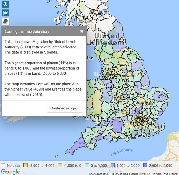
Telling a Data Story
Notwithstanding the hype and the tomes written about ‘visualisation’, much visualisation obscures more than it reveals. For 90% of us, the best explanation of something comes not on a map, chart or table, or in a ‘visualisation’, but in words. The majority of the population is wholly unused to interpeting a chart. Words on the other hand come easily to nearly all of us.
We take a chart or a map and turn what these pictures visualise into words – good English. There are three benefits. There’s the obvious benefit for those that struggle to interpret a map or chart – for these users there’s no more worrying about meaning.
The second benefit is that it’s a cure for writers’ block when starting a report. How many of us have stared at a chart with the pressure of a report to finish, sucking on a pen, wondering what on earth to say.
And finally, we developed Data Stories to start a journey. The Story will encourage the user to say something like … “oh, i see that, but what about …. “.
Which leads us to ….
Gavurin USPs : FOUR: Reporting is communicating – telling people what you’ve found

Created in PoweredBI by Gavurin
Reporting turns the analyst into someone of real added value to a decision maker. We believe that beautiful output encourages people to engage with results.
The point about beautiful output is that we recognise the need for it and we create an environment in which it can happen. If you find the offered chart title boring – please change it (easily); if you want to add an image, drop it in to your report (easily); if you want to add commentary and put it ‘there’ – then that is trivial. Beautiful output, easily.
And there is also the need for currency. There is no point in creating gorgeous output of informative maps and charts, supported by elegant prose, when it’s out of date. It must be possible to update and maintain content easily and speedily with minimum intervention.
Here we recognise that much reporting in organisations is repetitive. Consequently, keeping important but repetitive reports current when so much data changes can be tedious. And tedium creates boredom which is the precursor to error.
If core updating can be made easy the commentary can be emphasised – more time for that, less room for error.
These 4 Gavurin USPs combine to deliver significant benefit to the user and to the organisation. Benefit counted in real time, real money and fewer mistakes. There’s more here on our approach to Guided Data Discovery.
Get notified when new content is added
Join our mailing list to receive notifications when new content is published
You have Successfully Subscribed!