IMD stands for Index of Multiple Deprivation (IMD). IMD is a data based (i.e. it’s based on data), statistically robust, reasonably accurate window on the conditions found in areas in the UK, that house between 1,000 and 3,000 people. And here’s the killer point – IMD covers everywhere. So at one extreme it is the Index of Multiple DEPRIVATION, but at the other, a better title would be the Index of Multiple WEALTH. Or better still: Better Micro-Targeting
IMD covers 8 topics (7 + a total), which identify levels of wealth and deprivation in around 35,000 small areas of England (There are different IMDs in Scotland & Wales).
First thoughts suggest that we’re dealing with 280,000 data points. So, this is not ‘big data’. There are real useability challenges however. For example:
- Using IMD conventionally is not intuitive. Although the data is referred to as an ‘Index’, places are typically thought of not by an index score but by rank. And the first in the list is typically the most deprived. So, although IMD should be useful to many, it’s use outside the public sector is limited by (a) not understanding where (for example) the number 445 sits in the list and (b) by the fact that the top of the list is the MOST deprived and not the LEAST deprived. Most of us find this counter-intuitive.
- Outside the public sector the use of word ‘Deprivation’ in the title limits its application. As I’ve said, IMD is not just about poverty – the place numbered 35,000 in the list is the most well-off in England.
- IMD is not just one Index, it’s 8. Places are not uniformly poor or wealthy – they’re good on some factors, bad on others. IMD recognises that but to use all 8 variables (they’re called ‘domains’ in the jargon) requires good analysis and visualisation.
- IMD is about geography – and that can be big or small. Users need to be able to move around – from Aintree to Arsenal, and up and down – from Aintree to Liverpool, easily.
In short, IMD is a great example of great (but not big) data which is limited by the tools available to use it.
In a very British way, perhaps we ought to apologise for showing how we manage IMD better than others. So, we’re sorry – but it’s time not to be shy about G-View.
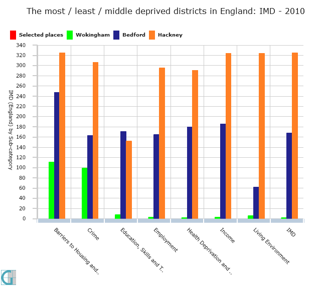 This chart compares three districts in England across all 8 topics or domains. Wokingham is the second most privileged place in England; Hackney is almost the least privileged. Bedford represents a mid-point.
But these are BIG areas. This article is about MICRO-targeting. So let’s get micro.
It’s important to get micro because in cities particularly, the rich and the poor live cheek by jowl. Walk round the corner and you could be in a different world.
This video homes in on Hackney – one of the most deprived large places in England but which captures real differences. The video moves speedily across all 8 ‘domains’ and you can see how widespread differences are. Note the legend. Yellow places are WEALTHIER.
Get notified when new content is added
Join our mailing list to receive notifications when new content is published
You have Successfully Subscribed!